If you’re planning to promote anything on the internet (or anywhere, really), the odds of your product/message being seen go up dramatically if you include a graphic. Think about how many text-only ads you’ve responded to lately.
There haven’t been too many, huh?
If you’re like me, you’ve seen plenty of text-only promos on Twitter. I’d say the effectiveness of these depends on the popularity of the person posting, but even so, they’d get more exposure if a graphic was there. Because this is the internet and we like pictures.
A potential buyer has to see the message or product a certain number of times before they’ll buy. The exact number is up to some debate and depends on things like the popularity of the person doing the promoting and if the product is connected with something that’s already been well received. The standard number of exposures I’ve heard is seven, but other sources go as high as twenty. The point is we have to get our stuff in front of eyeballs several times before we see new sales/followers, and the quickest and most effective way to do this is with graphics. The good news is they are not hard to make.
So let’s talk about how to do that. In this post, I’ll discuss creating graphics that work well on Twitter and for Facebook ads.
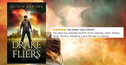
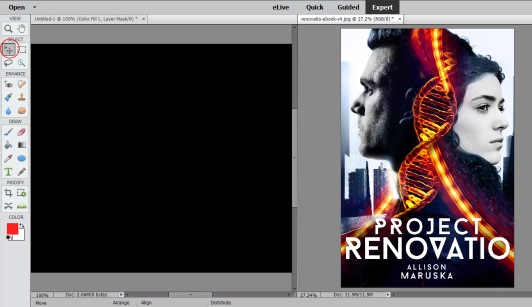
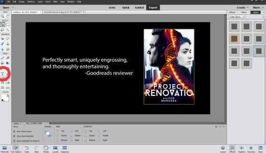
We’re gonna make one of these!
My program of choice is Adobe Photoshop Elements (which I’ll use for the demonstration), though I know other authors who use Canva or other programs for the same purpose. No matter which program you use, some standard tools (such as a crop tool and the ability to add text) should be there, and those are really all you need to create awesome graphics quickly and easily.
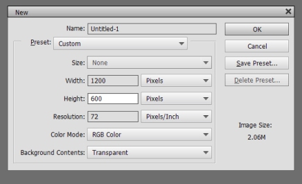
First, you need to know the dimensions of the graphic you’re creating. For Twitter, 1024 x 512 pixels is best (thanks to Rayne Hall for that tip), and Facebook ads are 1200 x 628 pixels. That said, as long as your primary image (like your cover) or your message don’t hug the border too much, you can use Facebook-sized graphics on Twitter and not lose anything.
I’m using screenshots, but if you want to see the whole thing in action there’s a video at the bottom of the post.
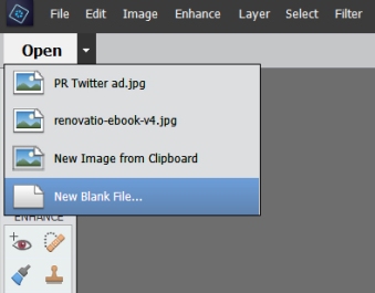
First, create a new blank file. Use either the arrow next to “Open” or go through “File” in the menu.
Then change the dimensions to whatever you need. This would be for a Facebook ad.
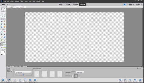
That gives you this nice blank layer.
You probably noticed the orientation is landscape, while book covers are usually portrait. That means you need to put it on a background. You could go straight white or black or use whatever color you want.
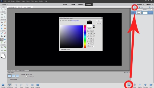
My computer wouldn’t screen shot the open menu, so click “layers” at the bottom and that circle thing at the top to open the color selector.
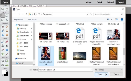
Then, open the image you want to use in your graphic (this will likely be a cover if you’re an author promoting a book).
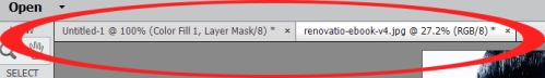
You now have two open work spaces at the top – your background and your cover.
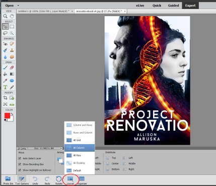
We want the cover on the background, so you need the spaces to be side-by-side. Click “layout” on the bottom to do this.
Now you can use the little grabber tool I circled in the top left corner to click and draaaaag your cover over to your background.
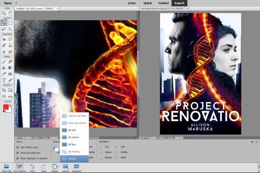
Holy crap, it’s huge over there!
Don’t worry. The cover image is way bigger than your Facebook image, so that’s what happens. Click “default” under “layout” on the bottom. Then use the grabber tool to drag the image until you get to a corner.
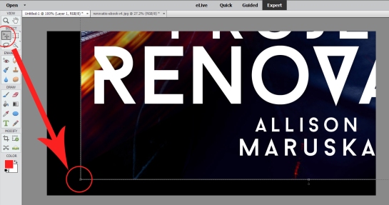
Click and hold on that corner and drag towards the opposite corner until the cover is the right size.
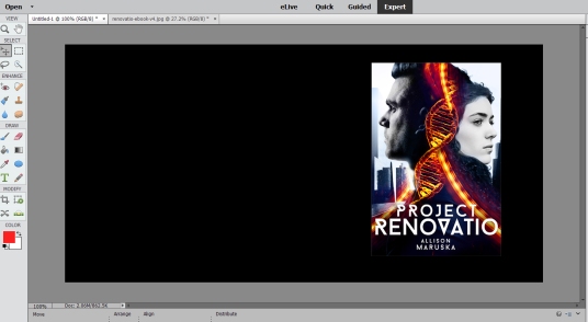
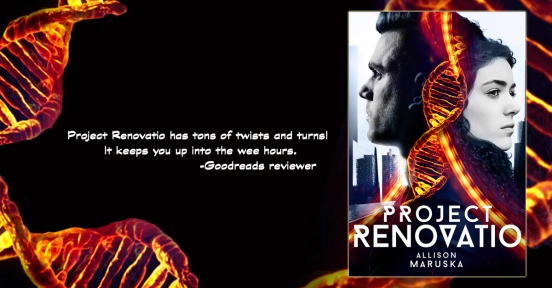
Now you have all that space on the left to put a review, information about a sale, whatever. Screen shots of reviews are my favorites to use on these graphics. That demonstration is in the following video. For now, we’ll copy part of a Goodreads review using the text tool on the left.
Note for Facebook ads: They have a strict “no more than 20% text” rule. Twitter has no such rule but be careful not to clutter up your ad with a lot of text.
I also added a glow around the cover, since the black background blended with the black part of the cover a bit.
In my real Project Renovatio ads, I cropped out part of the DNA and used that to enhance the image further.
I know all those screen shots looks like this takes a long time, but with practice you can create ads like these in just a few minutes.
If you want to see it in action, check out the video. It’s me talking through the process, and only one annoying popup happened. Enjoy!


Pingback: What Did You Like? 2016 In Review | Allison Maruska
Wonderful information! Thank you!
LikeLiked by 1 person
You’re welcome! 🙂
LikeLike
Pingback: Friday Roundup | Stevie Turner, Indie Author.
Reblogged this on theowlladyblog.
LikeLike
Thanks for the reblog! 🙂
LikeLike
I use use PhotoElement 13 and PhotoZoom5 to clear up the pics
LikeLiked by 1 person
Thank you. I’m bookmarking this.
LikeLiked by 1 person
Nice! Glad it’s helpful. 🙂
LikeLiked by 1 person
Reblogged this on Kim's Author Support Blog.
LikeLiked by 1 person
Thanks for the reblog!
LikeLike
Fantastic! Thank you.
LikeLiked by 2 people
You’re welcome! 🙂
LikeLike
❤ ❤ ❤
LikeLiked by 1 person
Thanks for sharing these steps Allison. I’ll have to do a little practicing now, but I’m bookmarking. 🙂
LikeLiked by 1 person
You’re welcome! Thanks for reading and commenting! 🙂
LikeLiked by 1 person
Always a pleasure. 🙂
LikeLike
Reblogged this on Dan Alatorre – AUTHOR and commented:
You definitely want to check out this helpful post!
And are you following Allison’s blog yet? Why not???
LikeLiked by 1 person
Thanks for the reblog! Nice comment too. 🙂
LikeLiked by 1 person
Sure. This is a great message and a great lesson by a great author.
LikeLiked by 1 person
I always struggle with this. Thanks so much for the step by step guide!
LikeLiked by 1 person
You’re welcome! I’m glad it’s helpful. Thanks for reading and commenting!
LikeLiked by 1 person
You make this all look easy! Thanks for sharing your insights.
LikeLiked by 1 person
It’s easy after a little practice. 🙂
LikeLiked by 1 person
That’s probably important to note. You move through it pretty quickly because you know what you’re doing and others will be that fast after a few attempts. Good job!
LikeLiked by 1 person
Reblogged on Illuminite Caliginosus.
LikeLiked by 2 people
Thanks for sharing with your readers!
LikeLike
Pingback: How To Create An Eye-Catching Promotional Graphic | Illuminite Caliginosus
Reblogged this on Chris The Story Reading Ape's Blog and commented:
Great information from Author Allison Maruska 😀
NOTE: Most Image or Photo Editing programmes, that have a Layers Facility, can be used to do these promos 😀
LikeLiked by 2 people
Thanks for reading, commenting, and sharing with your readers! 🙂
Yep, there are many programs to choose from. The key is to find one you’re comfortable using.
LikeLiked by 1 person
Indeed Allison 👍😃
LikeLike
I love how you did this, is the system you used, Adobe Photoshop Elements expensive?
LikeLiked by 1 person
I believe it is around $90 for the Elements program I use. They say it’s meant more for photo editing (I also use it for that), but it’s easy to use for anything else I need, like these promos or the logo I created for Dan Alatorre’s writing contest. There’s an even fancier Photoshop program geared towards graphic designers that is more expensive – around $150, I think.
LikeLiked by 2 people
That’s not too bad, considering the benefit. But just how complicated is it? I’m pretty stupid when it comes to that level of technology!
LikeLike
It’s not too complicated with practice. Figuring out where everything is was the trickiest part for me. If you go for it, feel free to email me with questions.
LikeLiked by 1 person
I might just have to take you up on that!
LikeLiked by 1 person
Reblogged this on Anita Dawes & Jaye Marie.
LikeLiked by 1 person
Thanks for the reblog! 🙂
LikeLiked by 1 person
Thank you for the lessons. I’ll be using them in the future.
LikeLiked by 2 people
You’re welcome! I’m glad you find them useful. 🙂
LikeLike